
A Color Scheme Speeds Up the Scrapbook Process
Selecting items for a scrapbook page can be time-consuming and often requires more brain cells than I can muster. I have discovered one trick that works wonders. I choose a color scheme that complements my photo first. Once you’ve decided on a color palette, it’s easier to identify the right paper, embellishments, and ephemera that will harmonize with your photo and create a cohesive page.

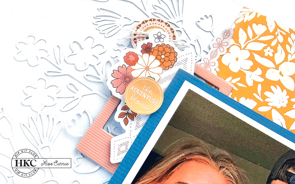
This summertime layout was created using elements from the June Hip Kit. Having a complementary color scheme in mind made the selection process uncomplicated and the assembly simple.
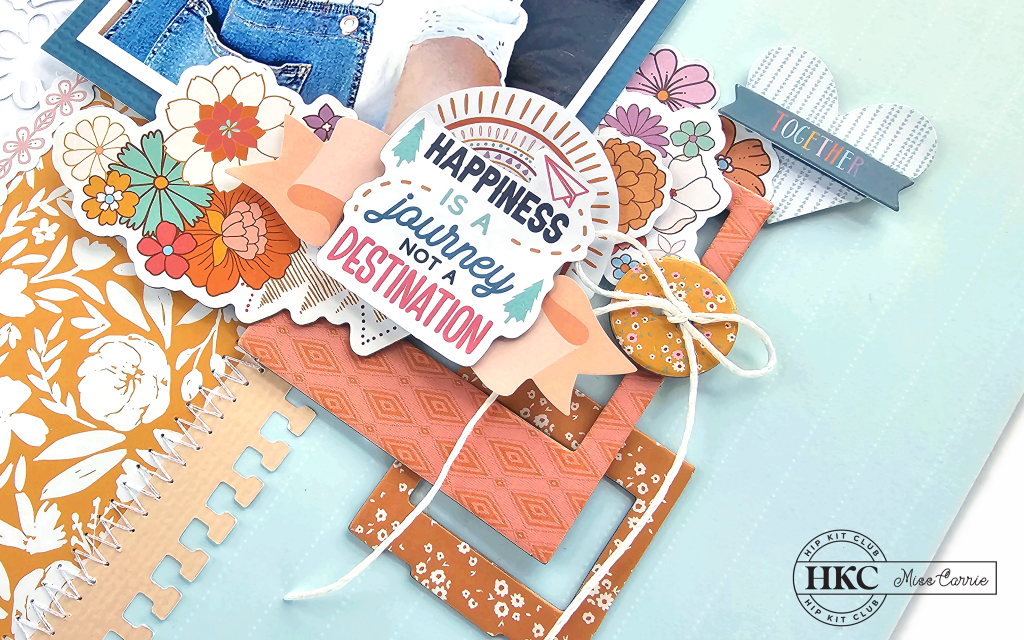
One great thing about using complementary colors is that they create a strong visual impact. This blue and orange combination is a great choice for creating a bright and summery feel.
Blue is often used in summer designs because of its correlation to water and sky, while orange has a bright energetic feel. Paired together, they create an eye-catching arrangement.
It’s important to pay attention to the specific shades of blue and orange that you use in your design. Bright, vibrant shades of both colors can create a playful and spirited vibe, while softer or more muted shades can create a more calming effect.
I chose different shades of blue and orange throughout my design to add depth and interest. I also added different patterns and textures to create a unique look.
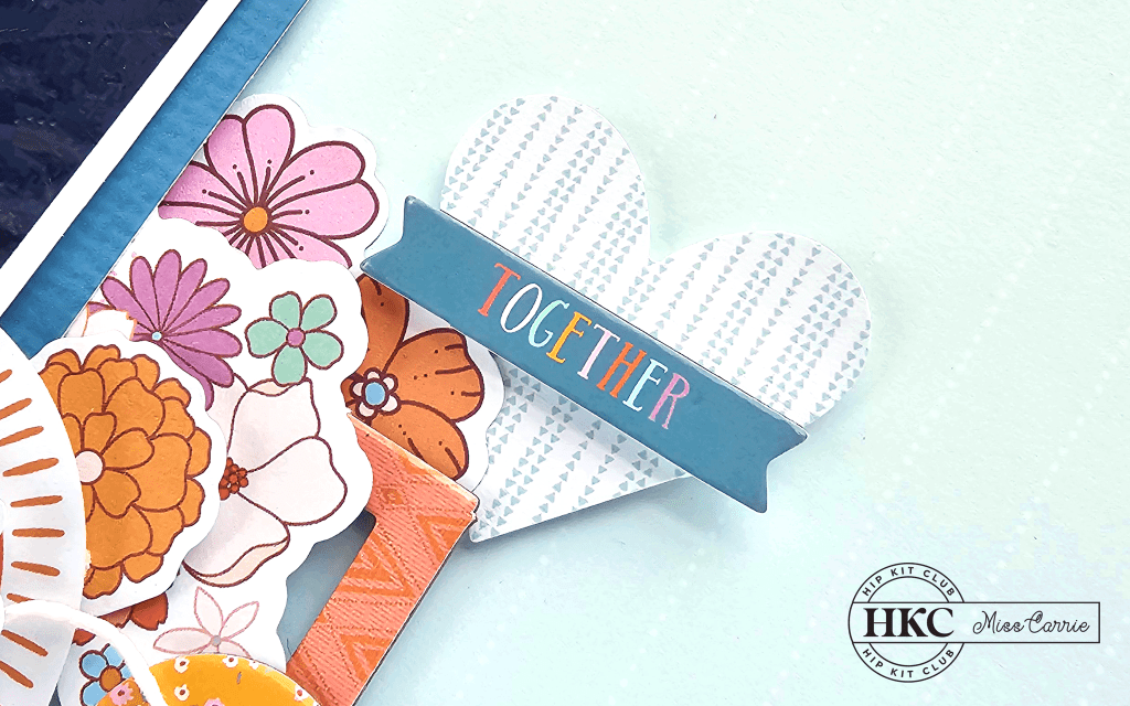
Once I had decided on the color scheme, I choose one color as the dominant hue and the other as an accent. In the photo, blue is the prevailing color, so I chose that as my primary.
In my video, I share how I selected items for my page to fit with this color scheme and show you how this layout came together.
Having a color scheme in mind helped me to create a cohesive and balanced design without having to overthink the process. Complementary colors, like blue and orange, create a natural contrast that is both eye-catching and harmonious. It’s also a great color combination for your summer photos.
I’m so excited to see the projects that you create. Don’t forget to share your finished creations with me. You can leave me a comment below with a direct link or tag @misscarriescreations on your favorite social media site.

Hey friends! I wanted to let you in on the products I use in my videos. Just so you know, I’m not getting paid to promote any of them, but I do have some affiliate links available if you want to check them out. If you end up buying something through those links, it would mean a lot to me and my business. And don’t worry, you won’t be charged any extra. Thanks for your support! Learn more