


Bright colors do not fall within my comfort zone, but I like using them sparingly on summer pages. Vivid colors can be difficult to balance on a page if you are not comfortable using them, so I am going to share how to add sunny elements to a page without feeling overwhelmed.

Before you begin, choose the color palette using items in the photo, the theme, or one that represents the feeling of the page. On my layout, I wanted it to have a bright summer feel that reflected the story of summer break. If you have difficulty choosing a color palette, I have a guidebook that might help.


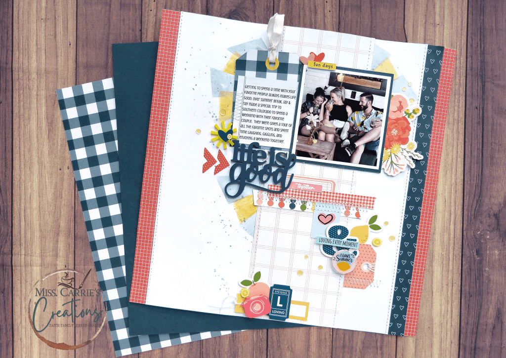
The next step is to select the amount of each color you want to use. I use the gallon-quart-pint ratio for my projects which I also talk about in the guidebook. On this page, blue is predominate, followed by orange, then yellow.
The title, journal tag, and the strip of paper that frames part of the page. In each of the clusters, I added a larger blue element to bring that color to the forefront.

Orange is a contrasting color to blue, so it made sense to treat this as my secondary color. There are varying shades of orange on this page ranging from red-orange to peach to coral. Each of these was repeated in the embellishment clusters and throughout the page.
Yellow was used the least, and it probably has something to do with my subconscious not being a fan of the color, but I wanted to bring in the lemons to this page. The fruit was printed on his shirt and in the summer drinks.

I brought in the lemons to the page through die cuts, flair, and those adorable lemon clay bits. Little elements like this bring color and texture to a page.
In my video, I share how I balanced out the page by bringing in some more of the orange color and how I added elements to each of the clusters.

This linear layout is one that you can recreate using items you have in your collection. Finding balance with vivid pieces doesn’t need to be difficult if you know how to put them together.
I hope today’s project inspired you to try something new. If it did, I would love for you to share your creation in my facebook group or by tagging @misscarriescreations online.
I hope this inspired you to try something new. If you have any questions about this project or the supplies listed above, feel free to leave me a comment.


Hey friends! I wanted to let you in on the products I use in my videos. Just so you know, I’m not getting paid to promote any of them, but I do have some affiliate links available if you want to check them out. If you end up buying something through those links, it would mean a lot to me and my business. And don’t worry, you won’t be charged any extra. Thanks for your support! Learn more